This is the first post in my Behind The Scenes series where I show you my project process as it unfolds. It’s fun. It’s messy. And hopefully you find it interesting!
Benjamin and Lorie from A New Possibility have given me permission to share our work and communication with you.
Benjamin first contacted me in April 2013 (no that’s not a typo, it has in fact been over a year of working together!).
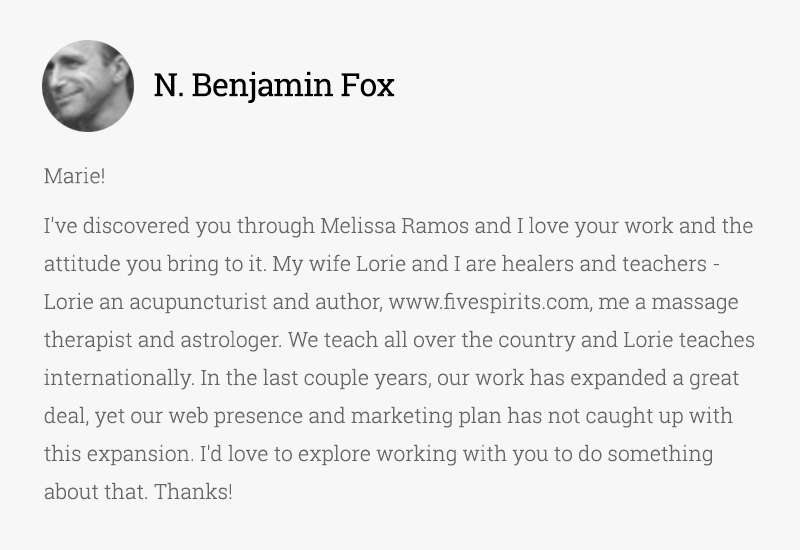
Wow, what a lovely introduction! I get a lot of work requests each week; the way they opened with their admiration for my work/attitude helps me feel more invested in them already (and of course, I tend to trust referrals from people I know).
I responded at the time that I was fairly booked already, but if they were open to waiting a few months, we could arrange a Skype chat, and make sure we were a good fit. They responded that it was more important for them to have a flexible timeline in order to ensure that the experience was positive, and that they were hiring the right person for the job (aka they were willing to wait).
After establishing our start dates and the project scope, the next step was to move our project communication into Basecamp, the project management tool I use to manage all of my client projects. My brain would surely melt if I had to manage all of our communication via email…
I also started a Pinterest mood board where I encouraged them to pin anything relevant to the project: visuals, colours, symbols, photography, and anything else that related to the overall project look and feel.
Inspiration
We began by pinning images to the Pinterest board, and a few specific images I posted to Basecamp to encourage further discussion.
Follow Marie Poulin’s board A New Possibility on Pinterest.
Pinterest allowed us to get on the same page about the desired look and feel, by enabling us each to comment and give feedback on our various pins.
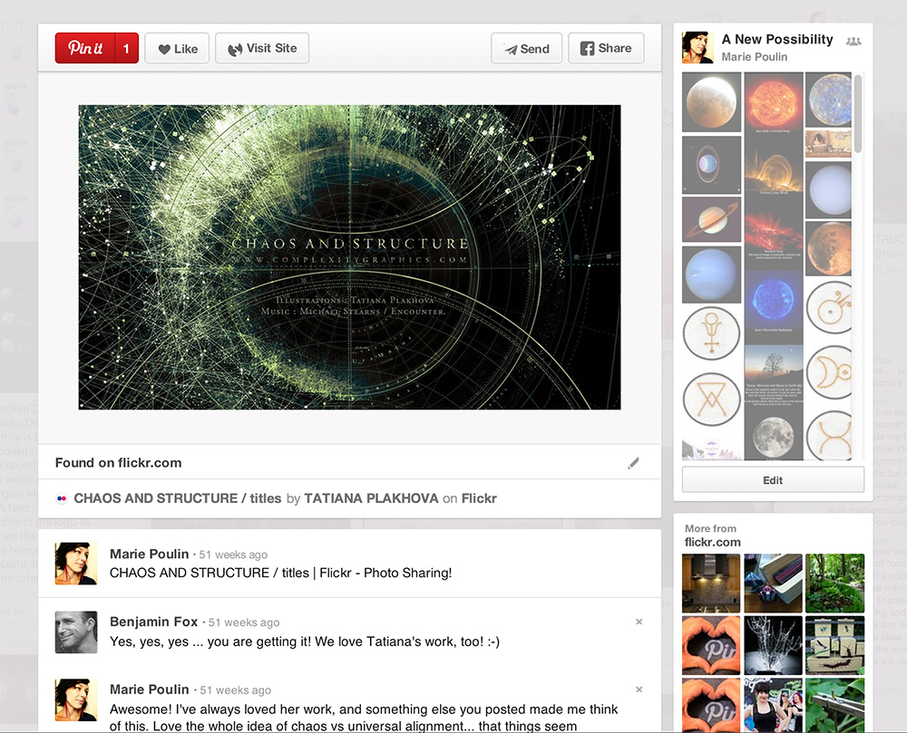
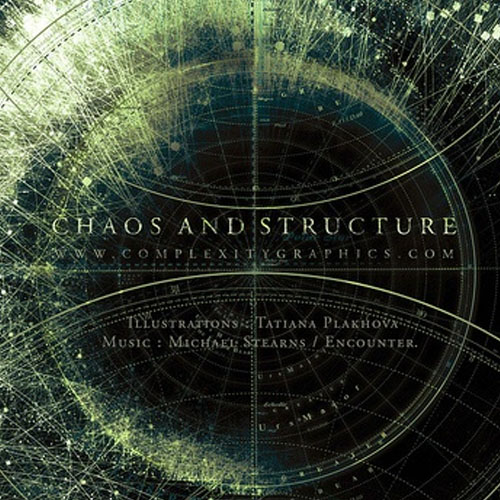
Here are some of the images and inspiration that represented the look and feel we wanted to achieve with their new identity. Some of our visual and conceptual themes included: alchemy, light emerging from darkness, astrology/moon/sun cycles, the horizon, and planetary symbolism. They wanted something planetary, but not too “new age-y.”
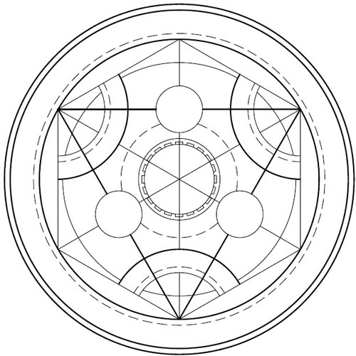



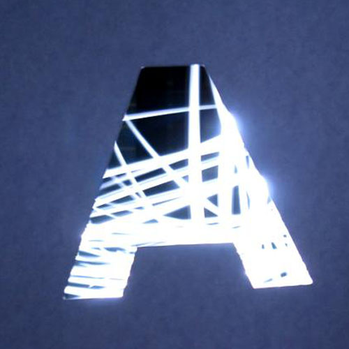
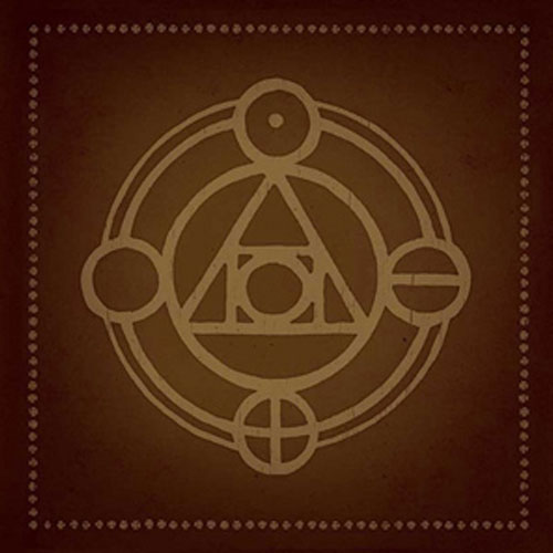
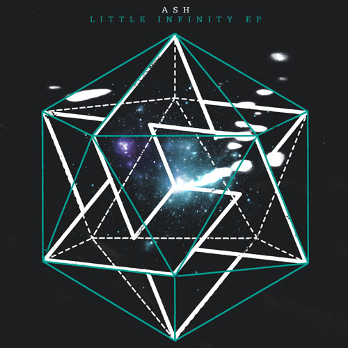
First sketches:
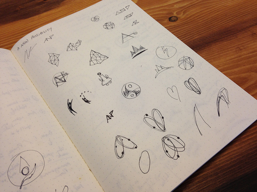
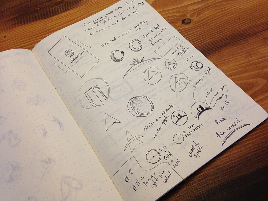
Here are the first sketches that I started with. I can’t help it… It is much faster in for me to explore concepts in illustrator than in pen or pencil, so I only tend to do a few pages of sketching and exploration before I move on to digitized explorations. I’d love to get better at sketching, so it’s something I want to devote more time to in the future. But for now, this is all I’ve got:
First explorations:
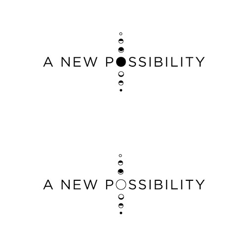
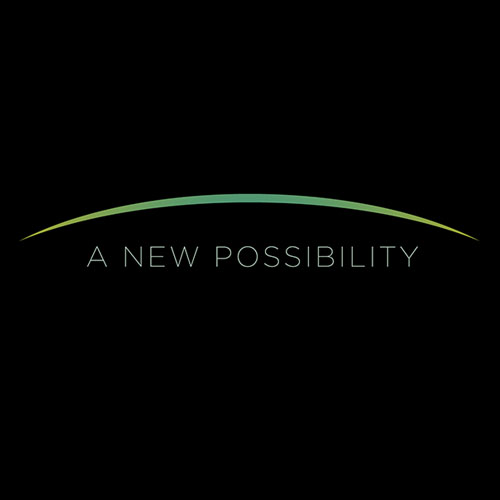
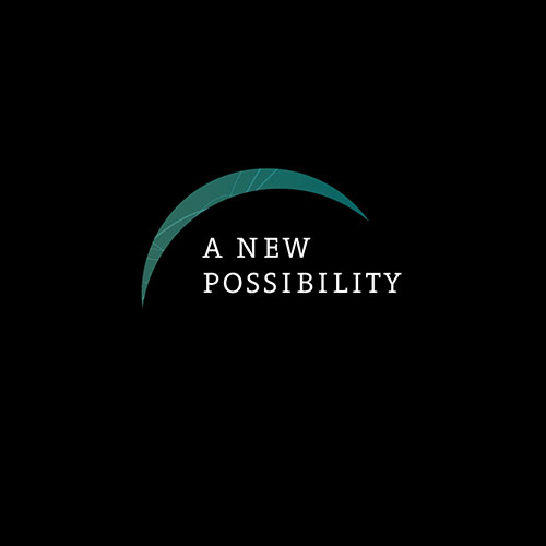
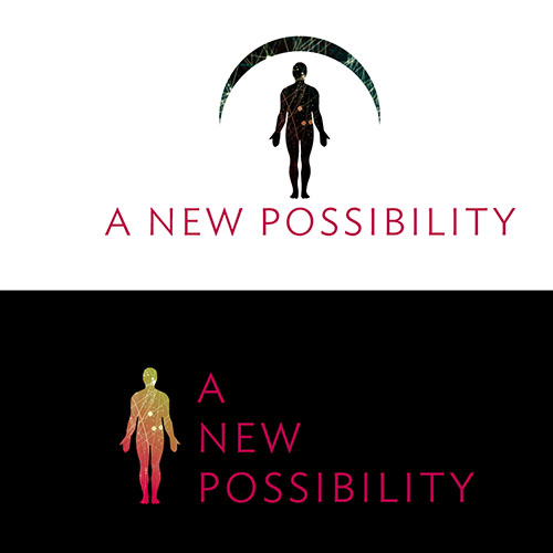
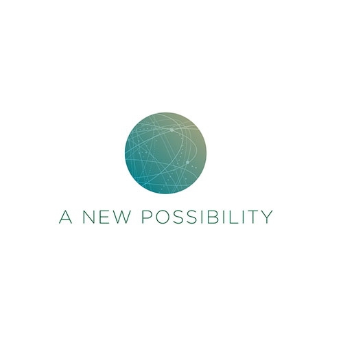
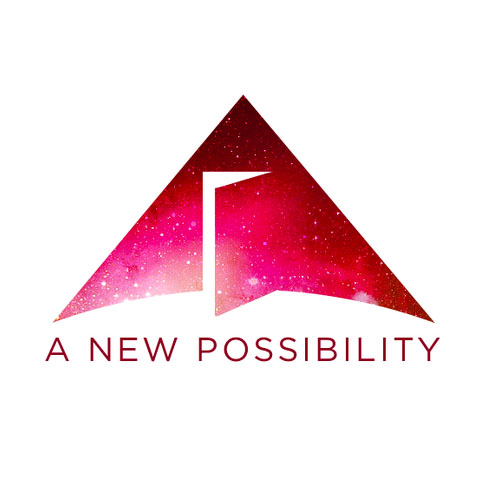
Here are the first digitized explorations for the logo.
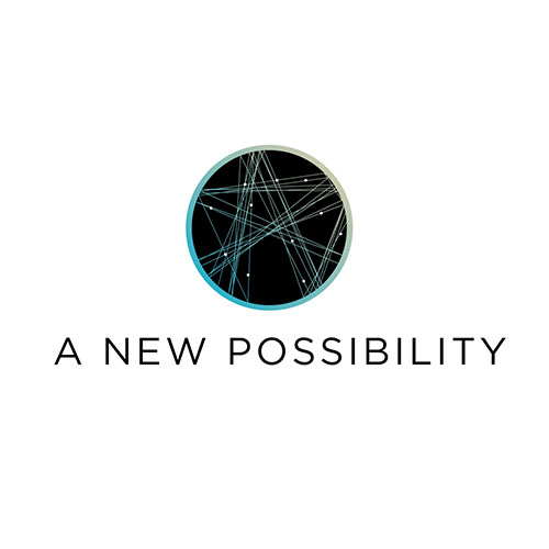
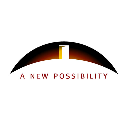
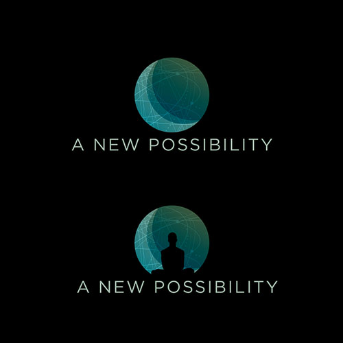
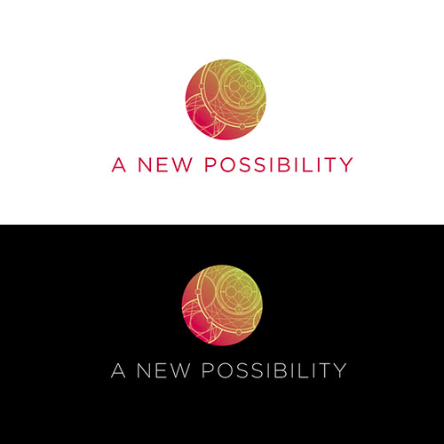
Revisions
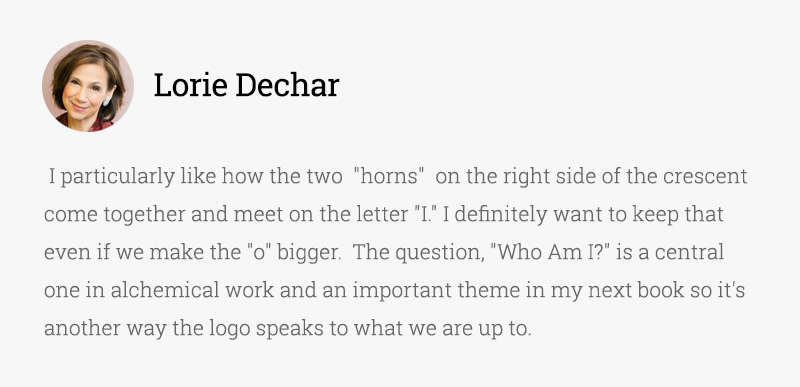
After the first round of concepts, Lorie and Benjamin said that they wanted to work with the crescent shape, but wondered if there was a way to capture the essence of a sunrise from space. They also attached some imagery of a circle with a dot in the middle which is the alchemical symbol for gold and the astrological symbol for the Sun.
Here are a few of the concepts that came out of their feedback:
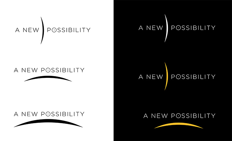
Lorie also mentioned that a circle with the dot in it is the Chinese character for light and the symbol for the “self” in many traditions, making it especially relevant to their business. The combination of the crescent implying “new horizons” and emerging light, combined with the circle and the dot symbol, which represents the Sun, gold, and/or the Self, started to provide more context for the direction we decided to take.
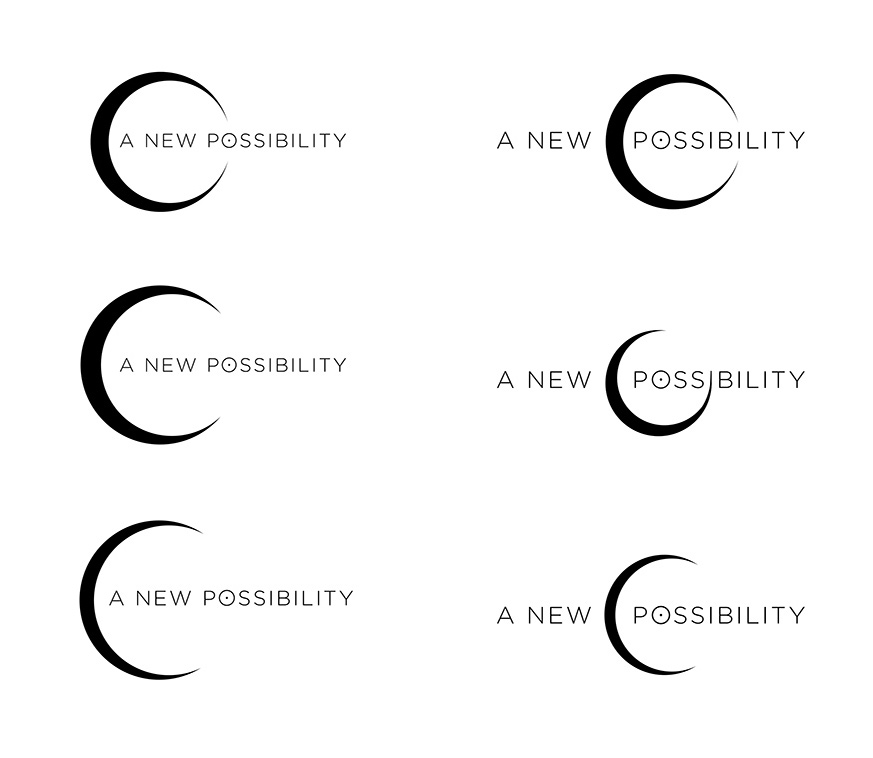
Working with this concept, I started exploring different ways to arrange the shapes and incorporate them into the wordmark so as to find the most appealing balance, and legibility at varying sizes.

Typography
I posted a few screenshots of some typographic selections from Typekit, which is the web font subscription service that I use for most of my clients’ websites. There was something very “fitting” about Soleil on so many levels. It is a very geometric typeface, which is important and congruent with alchemical symbology (especially the “O” shape). It also felt very appropriate that the word “Soleil” means Sun in french. It felt right, and we all agreed that Soleil had the right flavour.


Once we had our typeface chosen, and our logo direction, I began tweaking the shape/sizing/spacing/consistency of the letterforms, in order to achieve the right visual balance.
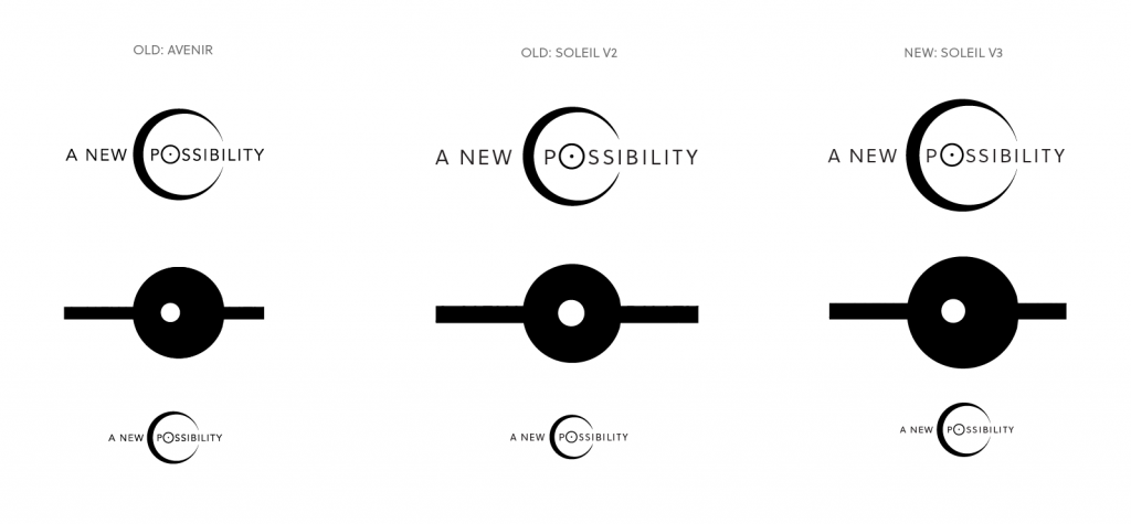
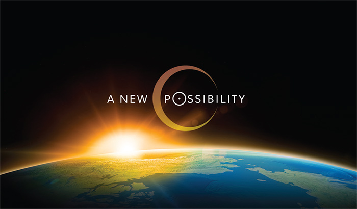
Once we decided on the balance that felt right (which ended up being the asymmetrical version on the right above), I worked the logo into our chosen (and heavily edited) sunrise image.
The final logo allows the light coming from the sun into the crescent, working with the theme of “light coming from within.”
The entire process was highly collaborative with lots of client input and feedback. This is very important in my own personal process because I believe that only with collaboration can we get the most effective final product. I take the reigns, especially with design related decisions, but I ensure that I am integrating relevant feedback from the client, especially when they can offer additional insight into concepts and symbology which go beyond my knowledge and expertise.
Benjamin and Lorie were absolutely thrilled with the final product, and the printer of their business cards even commented on how beautiful their business cards were!
“You have definitely played a big role in supporting the magic and we’re really grateful to know you and be working with you.” – Benjamin Fox
I really really enjoyed this logo design process, and hope you enjoyed seeing a bit of what happens behind the scenes on the way to getting to a final approved logo.
Stay tuned for their website launch next month!


What a pleasure to read this blog. It’s like watching the rewind movie of our past year’s work together. Each piece of this collaborative process has been an exciting adventure as we witnessed our vision for the site come to life. Through our work together, Benjamin and I have not only gotten a clearer sense of what we are up to in our business but of who we are as healers, teachers and agents of transformation in the world.
And btw, this blog, Marie, is as beautiful, engaging and intelligent as all the work you do. We are over the top grateful that we found you and that you were willing to take on A New Possibility and we are looking forward to continued collaboration over the coming years!
Benjamin and I have been collaborating about working together. He may have told you about me. I am an astrology teacher living in Vermillion, SD with a base in Minneapolis, MN. It was so exciting to see this site (Benjamin sent me the link). It is beautifully crafted and captures them wonderfully. Benjamin and I are beginning our discussions in earnest about how my classes can be neatly fitted into anewpossibility.
Congatulations and all the best to you!
Marie – collaborating with you makes waking up each morning an exciting prospect. And I mean it! Thank you for your kindness, your care, your knowledge, your patience, your generosity, and your vision. Lorie and I are deeply grateful.
You guys are seriously the best. Those are some of the most humbling words I’ve ever heard. Thank you SO much, i’ve SO enjoyed collaborating with you both!!
Marie, I absolutely love the logo, and I must say I’m quite fond of some of your first drafts! They look really polished, compared to what I tend to send in my first drafts.. 🙂
I’m always curious about other designers’ processes so I can learn something new and refine my own process! Thank you for sharing it with us.
It’s always interesting to know the behind story of a logo. Nice story and great collaboration between client and designer.
Keep the good work Marie.