When Natalie first approached me (via Twitter!) to redesign her website, She Takes on The World, she was armed with a creative brief, and had some very clear and measurable goals for the next iteration of her website.
The old website:
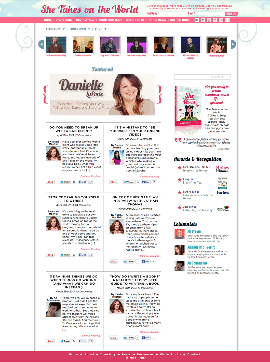
My goal is to at least double the number of opt-ins to our mailing list in a day, give the site a huge traffic boost of 25% or more, and see a lot more people tweeting things like “OMG I LOVE THEWEBSITE!”
I knew that Natalie wanted to build something totally unique and forward-thinking. Something that people in her industry would point to as example of brilliant design. There are so many blogs and websites out there (especially in her niche) that follow the very same formula, regardless of the context, and the same approach doesn’t work for every business!
I’m going to outline just a few of the strategic decisions we made in our process in order to demonstrate just how much strategic design decisions can make a huge, measurable impact on your business.
TILED CONTENT LAYOUT FOR HOMEPAGE AND BLOG CATEGORIES
One of Natalie’s biggest assets was her content creation. With tons of contributors and a plethora of great blog posts, a lot of her fabulous content was getting buried within her site navigation. Her category pages were somewhat hidden and hard to navigate to. We decided to clean up and rename her categories, and tile the content visually. This reduces the likelihood of people leaving the page because the first thing they see doesn’t necessarily resonate with them, or seem interesting. Now, with a quick glance, you get an overview of the breadth and depth of content she has available. The content blocks always stay the same size, but they reshuffle depending on the width of the user’s device.
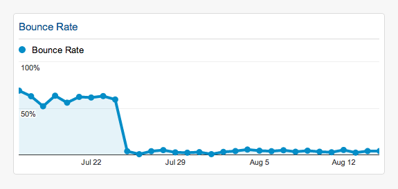
Impact: We reduced the bounce rate from 60% to 3%!
RESPONSIVE AND MOBILE READY
The Google analytics show that after launch, the number of users accessing the website on mobile devices and tablets had nearly doubled! Good thing we were ready; not only was the website built to be “mobile friendly”, but it was designed with mobile in mind. Some things you’ll notice in the mobile experience include: blog tiles are reduced to one column for easy readability, and the header opt-in disappears (Oh la la). In order to respect the mobile users’ experience, we focused on keeping only what was necessary! It’s a great start, but I do believe that we will continue to tweak the design over the coming months for an even better mobile experience. We also enabled full-width video embeds that increase when the user is on a desktop.
Result: A website that feels good to interact with on any size device.
SIMPLIFIED NAVIGATION
One of the major decisions we made in the last few weeks before launch was to reorganize the resources and the shop into a single resources page. Putting myself in the users shoes (I am part of Natalie’s target audience), I don’t go to websites to look for what I can purchase… I go to seek resources (and I’m often willing to pay for great resources!). Her resources page had previously been buried in her footer navigation. We decided to reposition all of her offerings as resources, with some of these being paid with a tweet (or Facebook post), and others being premium paid resources, and featured this page in the main navigation instead of “shop.”
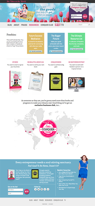
Her previous blog categories were hidden in a sub-navigation menu, and her main navigation was small and buried. We bumped up the typeface size significantly, and created much more space to lead the eye.
We colour-coded the categories both in the navigation and in the tiles to make it easier to identify the article categories, and reduced the categories to just 6.
Impact: While we can’t necessarily make any sweeping conclusions about how the navigation changes specifically impacted traffic, the analytics show a huge reduction in the bounce rate from 60% to 3%, and an increase in page views by 200%!
REMOVED SIDEBAR
One major decision we decided to make with the design was not to use a sidebar.
GASP! WHY WOULD WE EVER DO THAT? The Universe will implode!!
- It’s less cluttered.
- It forces people to focus on the content!
- Sidebars don’t translate well to mobile.
We chose to FOCUS ON THE CONTENT.
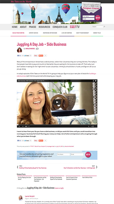
Too many people use the sidebar as a dumping zone for pretty much everything. Our plan was, if we build a website that has a really clean/clear navigation system, and full-width copy, then people will know where to find what they need, and they can read the content without any distraction. There’s no need to pull them into a million different directions: “hey click on this event!” or “check out these 10 most popular posts!” and “oh have you seen the freebies you can get when you opt in?” One thing at a time.
Cut the crap, and focus on serving your audience.
We simplified everything, and decided that going without a sidebar made the most sense for STOTW at this point in her business.
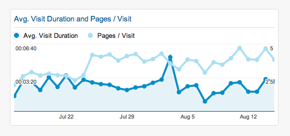
Result: We increased the average visit duration by 13%.
A MORE GRAPHICALLY INSPIRED OPT-IN
One of Natalie’s major goals with the site redesign was to double her opt-in rate. That was no small task given that Natalie already had a decently large list (hey, large is always subjective when it comes to email lists, right?). I knew that having her opt-in front and center was going to be a requirement, so the challenge would be to integrate it into the design so it didn’t detract or distract, but offered a clear call to action. We prominently featured the opt-in in the top right of her header, treating it graphically like a real piece of mail, in order to make it feel “special.” We even elaborated on what the Conquer Club e-mail program offers with a small “read more” tooltip. In earlier concepts we had tried to squeeze too much copy into that area, and it was far too busy and distracting. Keep it clean, and let them dig for more when they want to.
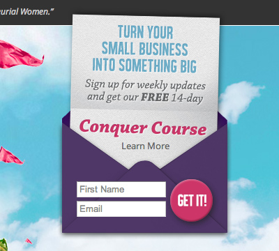
Low and behold, creating a bold, visually inspired opt-in more than doubled Natalie’s daily opt-ins!
Overall results compared to the month before launch:
• 75% Increase in Visits
• 200% increase in Pageviews
• Bounce rate reduced from 60% to 3%!! (visits in which the person left the site from the entrance page)
• Increased pages per visit by 70%
• Increased average visit duration by 13%
• Opt-ins doubled in the first few weeks, then dropped to 65% increase from previous rate
The final result? Natalie MacNeil was over the moon about her new website design. We exceeded all of her goals, and we both experienced a flood of positive feedback from users via Twitter, Facebook, and within her site’s blog comments.
I used to dream about working with a designer and developer like Marie, someone who could take my vision and fuse it with their own creative prowess to create a digital masterpiece. When I first got in touch with Marie I told her I had a goal of turning SheTakesOnTheWorld.com into a gorgeous online experience that was second to none in my niche. She was up for the challenge, and absolutely blew the top off my expectations. I have finally found the web designer of my dreams.
– Natalie MacNeil
She was also once again listed as one of Forbes top 100 websites for women, and one of 20 best marketing and social media blogs by women this year.
We worked collaboratively to make sure that the design of the new site was working to meet her goals, and the result is a highly successful design project that her audience enjoys interacting with. Our collaboration was such a joy and success that Natalie has asked me to mentor as one of her experts for her new Conquer Club program: a hybrid in-person and online community for entrepreneurial women. I’m always happy to help more entrepreneurial woman take on the world!


Leave a Reply